
What is a viewport meta tag in HTML? Located in the <head> section of the HTML, it is the visible area of a webpage. This area varies with the device.
For devices such as a mobile phone, the viewport is smaller than on a computer screen and tablet.
Viewports help users see web content properly on different sized screens such as mobile devices.
Back in the days when tablets and mobile were still a concept, webpages were designed only for computer screens. In other words, webpages had a static design and fixed sizes. This is not the case today.
Today webpages have a responsive web design that allows them to fit perfectly in all devices.
The <meta> tag
To allow web designers to build responsive web pages and take complete control over the viewport, <meta> tag was introduced in HTML5. Ideally, <meta> gives browsers instructions on how to control the behavior of page dimension and scaling across different devices.
Here is how to include the <meta> viewport element in your web pages:
<meta name=”viewport” content=”width=device-width, initial-scale=1.0″>
The width=device-width code ensures pages are resized to match the screen’s width. This is help scale pages depending on the device in use.
The initial-scale=1.0 part sets the initial zoom level when the page is first loaded by the browser.
If your device is not configured correctly it will display your site like this:
Why include viewport in your webpage?
As said earlier, including viewport in your web pages help design responsive webpage that scales well in all devices. This further help in achieving maximum mobile-friendliness in just a few steps. For example, if looking to reduce the time people spend resizing or scrolling your site, including viewport, solve this instantly. Keep in mind that Google supports responsive design, which is used to rank websites and an easy SEO win for you.
Here’s what Google had to say about viewport:
“Pages optimized for a variety of devices must include a meta viewport tag in the head of the document. A meta viewport tag gives the browser instructions on how to control the page’s dimensions and scaling.”
Testing your site responsiveness and viewport
Soon after completing your website, it is advisable to check the responsiveness of your website and see how it look on different devices. Tools like SERanking (Affiliate Link) are very helpful at this time. You can generate reports with them and see areas in your website you need to make some changes.
There are many things you can test your site with a tool like SERanking. For more information on how to use this tool, click here now to learn more. Alternatively, use browsers like Chrome and Opera to inspect and see how your site will appear on different devices.
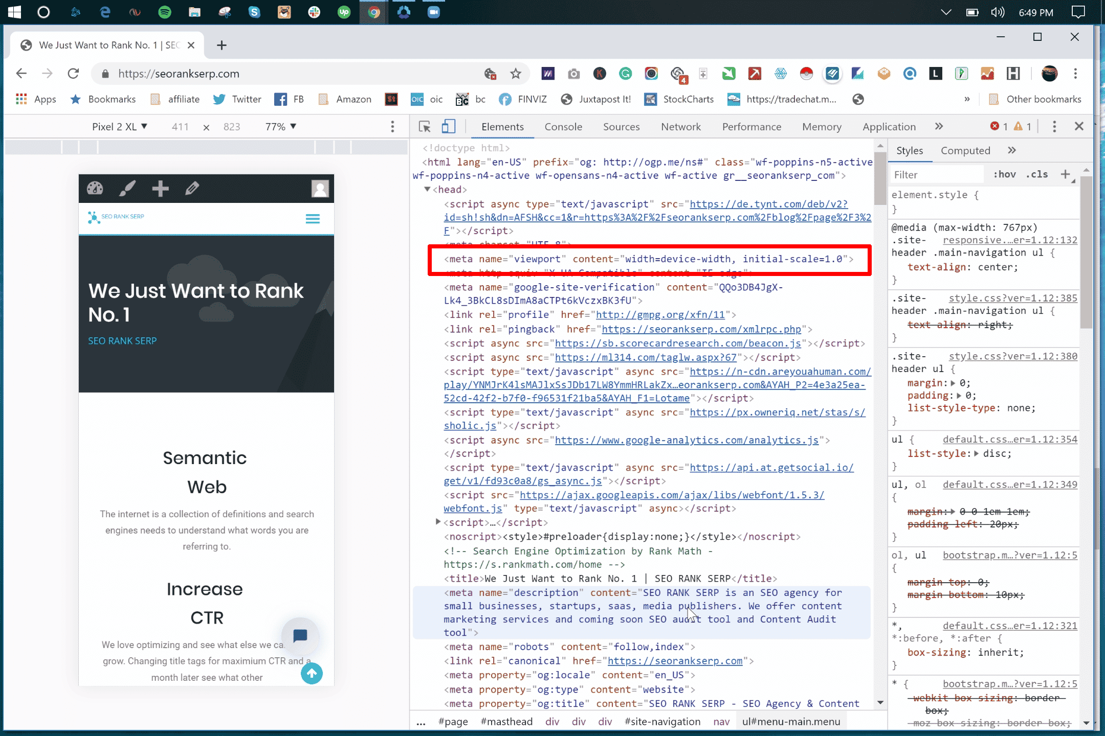
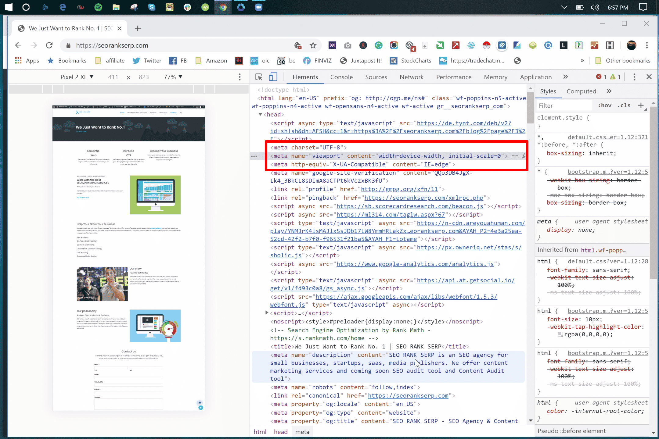
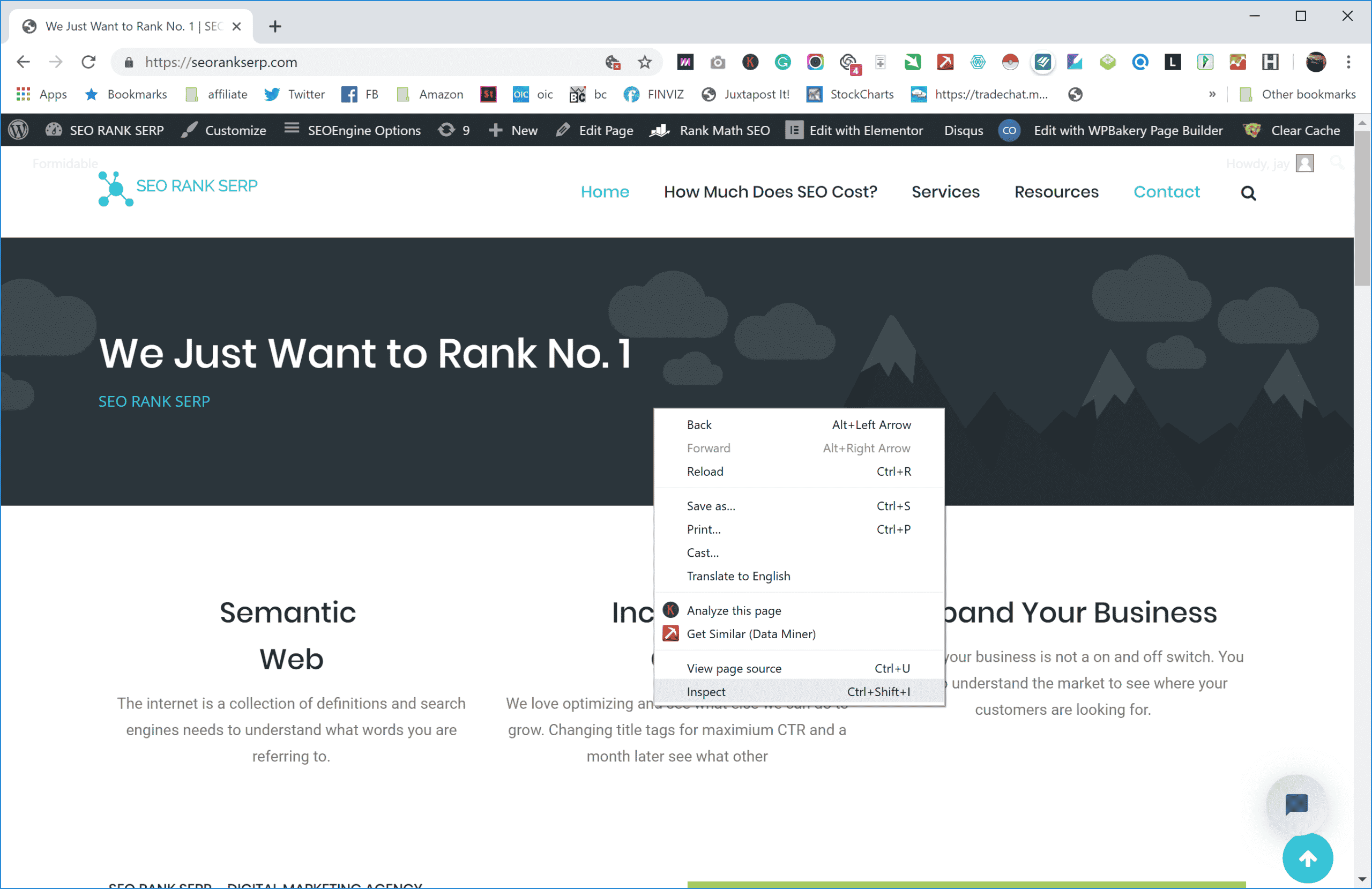
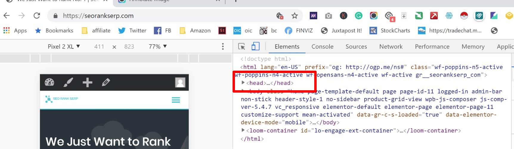
To see if you have viewport enabled, you can right-click the website on Google Chrome and click on Inspect Element:
And in the <head></head> section of the elements, you can find the viewport:
Best practices
Over the years, some viewport practices have been accepted and now used widely to build responsive websites. Below see some of the best practices you may want to consider when looking to develop a responsive website;
Use relative width values in your CSS such as vh vmin, vmax, em, rem, ch, ex, vw and % instead of absolute values like cm, mm, in, px, pt, or pc. The issue with using absolute values is that they may cause the elements of your site to load wider than your viewport allows.
Configuring your mobile viewport for your site
There are three main ways (Responsive, Dynamic, and Separate URL)to design a mobile-friendly website depending on your current mobile site design.
- Responsive design configuration
Recommended by Google and the easiest way to build a mobile-friendly website, this design allows designers to create a responsive website by adding a <meta> tag in the head section. As indicated above, this is how to do it.
<meta name=”viewport” content=”width=device-width, initial-scale=1.0″>
- Dynamic design configuration
This is the right approach if you currently have a dynamic design. You need to develop a separate page to serve different versions and tell each user agent what to access from the same URL.
GET /page-1 HTTP/1.1
Host: www.example.com
(...rest of HTTP request headers...)
HTTP/1.1 200 OK
Content-Type: text/html
Vary: User-Agent
Content-Length: 5710
(... rest of HTTP response headers...)
Here’s more information regarding dynamic design configuration.
- Separate URLs configuration
This approach calls for more development resources and also requires you to build a new website and host it on a subdomain. To help search engines to understand separate mobile URLs completely, you’ll need to create annotations for both mobile devices and desktops.
Here are examples of how to annotate each URL:
On the desktop page (http://www.example.com/page-1), add:
<link rel="alternate" media="only screen and (max-width: 640px)" href="http://m.example.com/page-1">
and on the mobile page (http://m.example.com/page-1), the required annotation should be:
<link rel="canonical" href="http://www.example.com/page-1">
This rel=”canonical” tag on the mobile URL pointing to the desktop page is required.
Sitemap annotation needs to include the following:
<?xml version="1.0" encoding="UTF-8"?>
<urlset xmlns="http://www.sitemaps.org/schemas/sitemap/0.9"
xmlns:xhtml="http://www.w3.org/1999/xhtml">
<url>
<loc>http://www.example.com/page-1/</loc>
<xhtml:link
rel="alternate"media="only screen and (max-width: 640px)"
href="http://m.example.com/page-1" />
</url></urlset>
Here’s more information on separate url configuration.
Configuring mobile viewport in WordPress
If you’re building a site on platform like WordPress, you don’t no need to worry much about mobile viewport since almost all themes come fully configured.
But in case you find your theme is not configured, feel free to do it. You can check if the viewport is added by using an SEO audit tool, or go to Inspect Element. If you do not have viewport added, you can go to Appearance>>Editor>>Header.php and look for the code there:
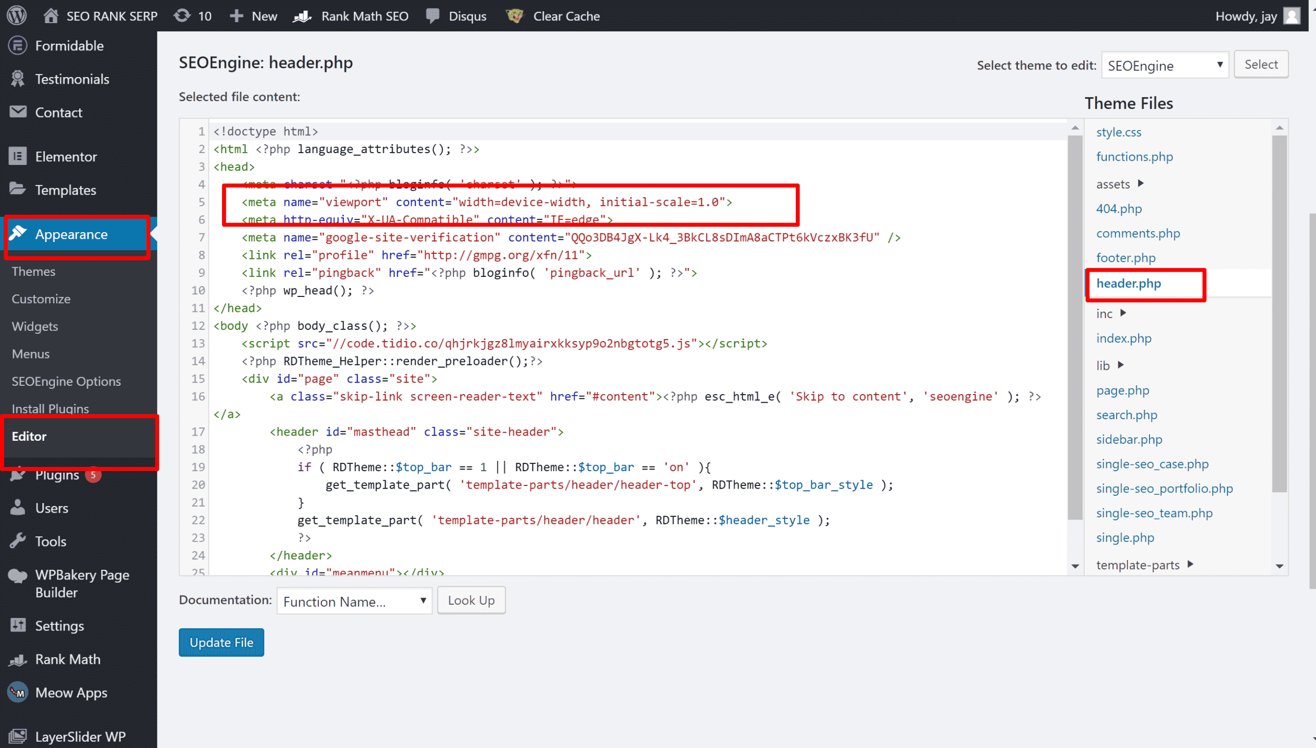
There, you go. You now have viewport enabled and mobile-first optimized. What other technical SEO should you be fixing?

Jay
I've worked for WooRank, SEOptimer, and working on a cool SEO audit tool called SiteGuru.co. Now I have build Linkilo and SEO RANK SERP WordPress theme. I've been in the SEO industry for more than 5 years, learning from the ground up. I've worked on many startups, but also have my own affiliate sites.

TRY OUR FULLY SEO-OPTIMIZED WORDPRESS THEME FOR AFFILIATE MARKETERS!
No need to hire SEO experts anymore to fix your site technical SEO issues
IMPROVE YOUR SITES RANKING TODAY